Avelo Airlines
Soaring high with a soul of service.
avelo airlines
Soaring high with a soul of service.
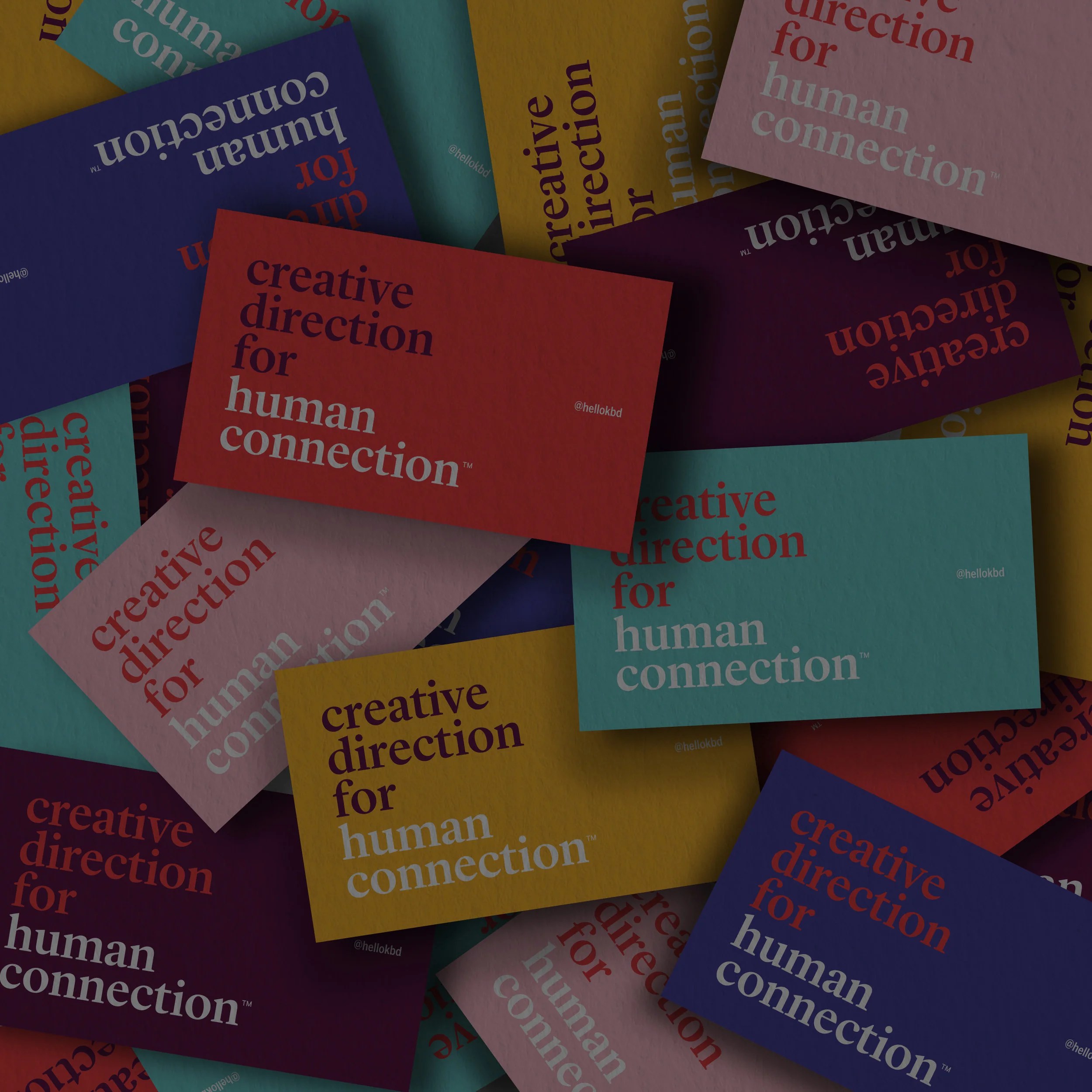
Naming • Visual Strategy • Logo • Visual Language • Livery • Uniforms • Signage System • Social Media • Website • Collateral • Guidelines
To build an entire brand from scratch is no small feat– never mind a brand new airline, during a global pandemic, completely virtually, in partnership with the CEO, never having met any of the team previously or in person, in a category unfamiliar to us, on an aggressively accelerated timeline. Can you say we like a challenge?
This entire initiative is the most admirable example of how business can be done in our post-pandemic era.
Our visionary client was dedicated to building this brand alongside a team of like minded, purpose-driven, independent professionals– each dedicated to their own vision of service. He took a calculated risk, choosing high-touch solopreneurs over proven agencies operating under a traditional model.
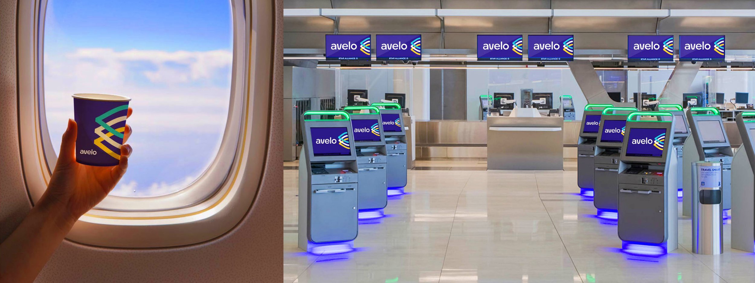
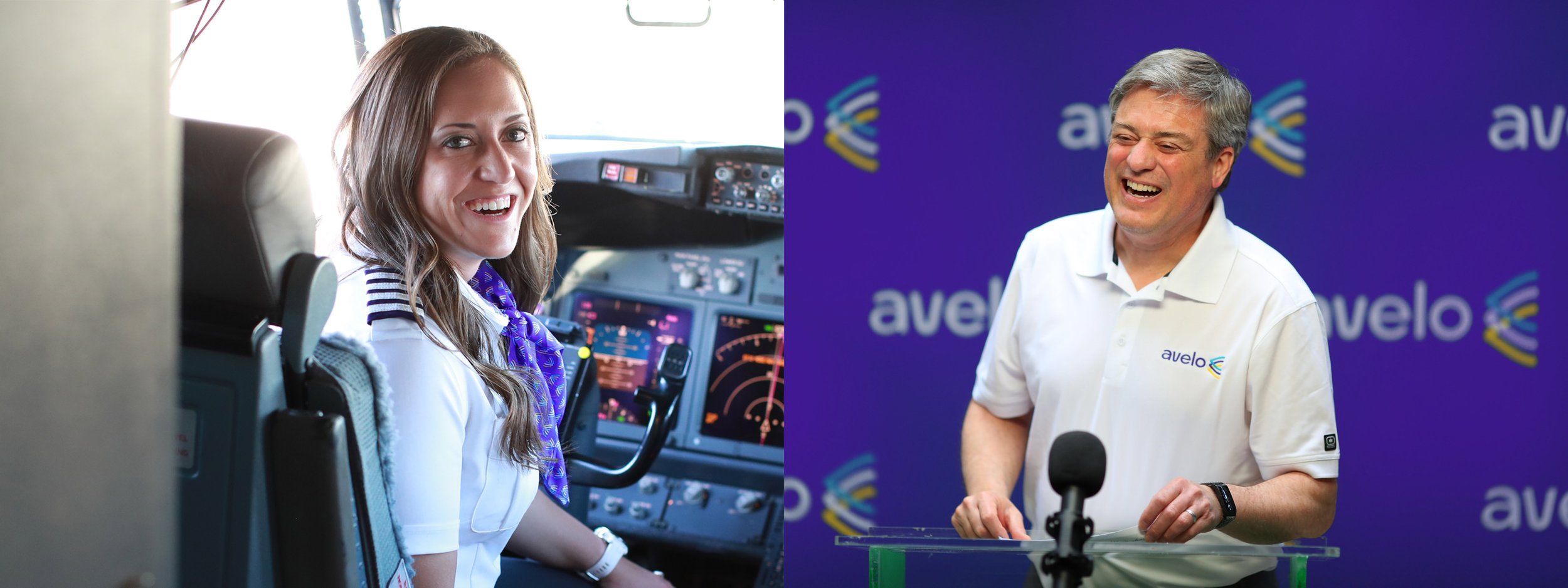
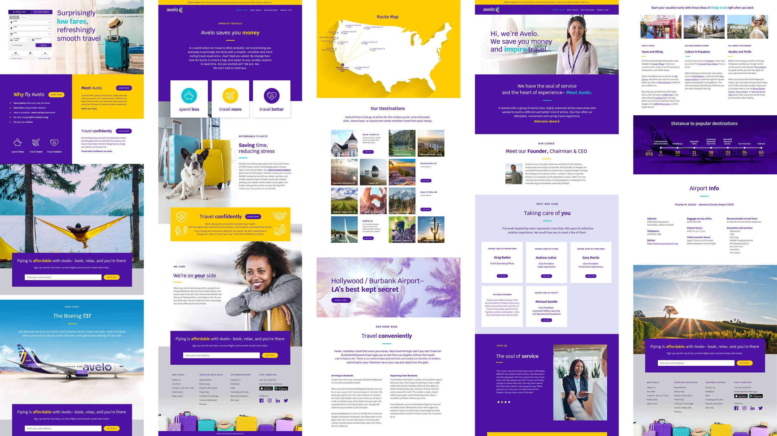
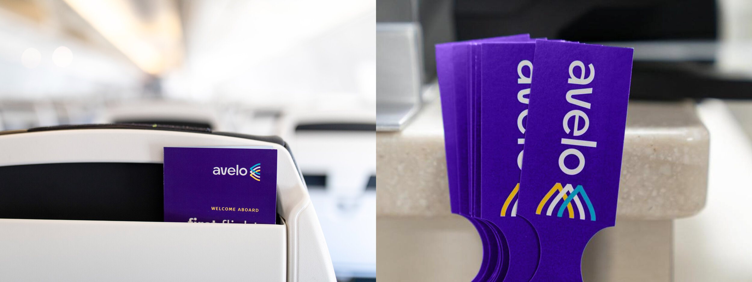
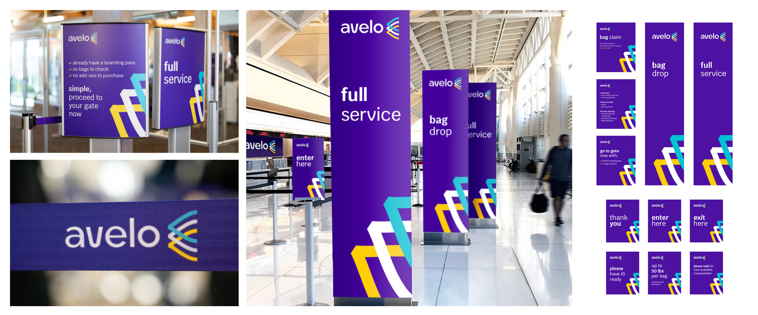
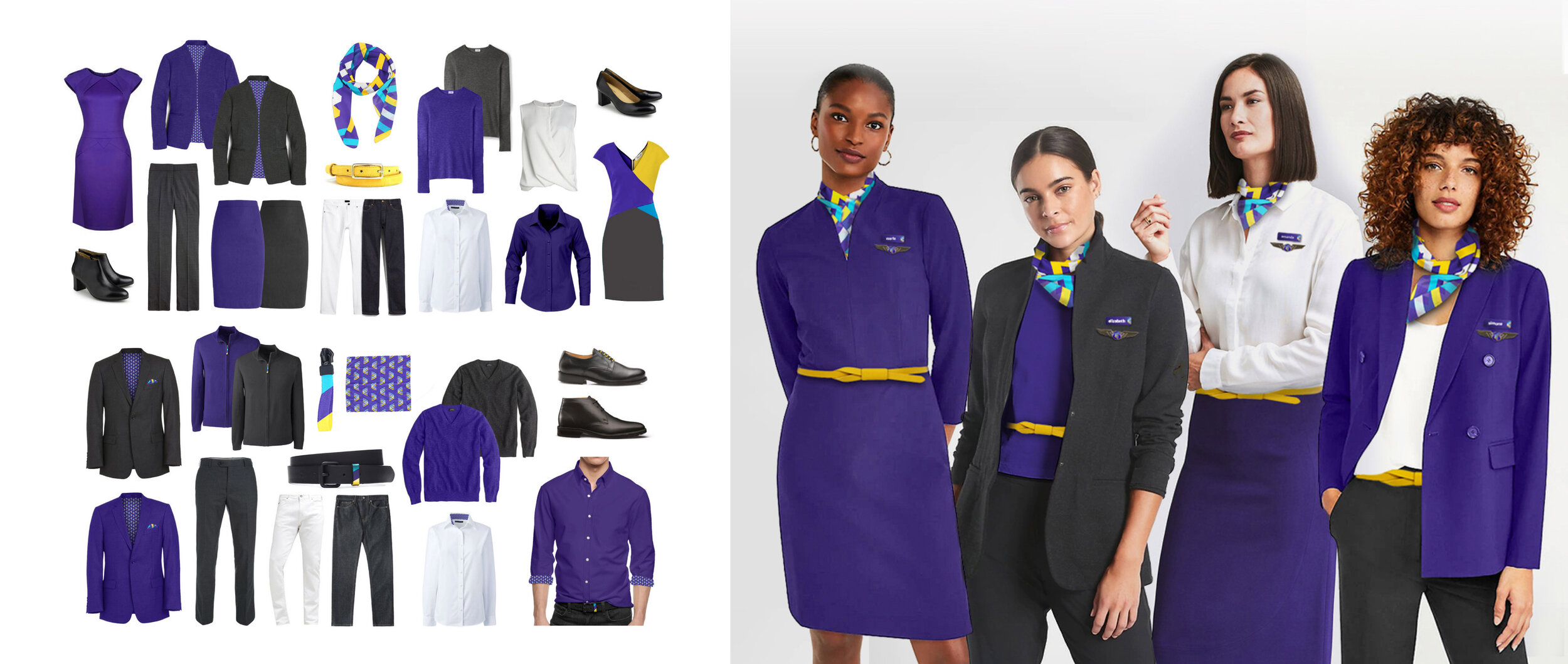
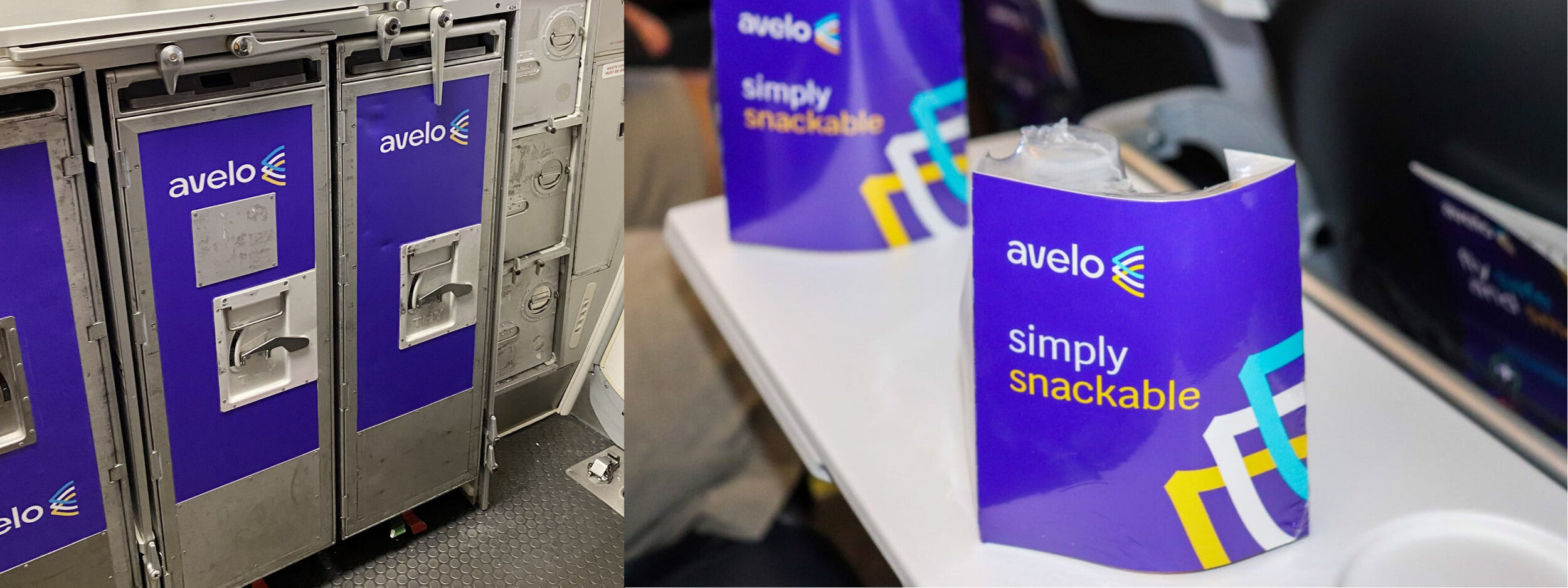
Our lean and mighty band of three (a strategist, a consultant and me) was responsible for everything from the strategy, to the name, to the entire look and feel of the brand globally. Design touches every experience along the traveler journey, from initial purchase to arrival at the destination. Included was visual strategy, media-agnostic brand identity, livery design, signage system, uniform program, cabin fixtures, in-flight experience, print collateral, website, email communications, social media and practically everything in between.
So much design these days feels weird, whimsical and wonderful– though falls short of delivering what the specific brand requires to engage with society and catalyze meaningful change.
It’s my desire for Avelo to be recognized not for being ‘cool’, or for the excitement it brings– but for offering a sense of safety and optimism in a time we need it most. A nod to the days when air travel was aspirational and something to look forward to. When choosing simplicity was an elegant statement vs. a dumbing down of things to the lowest common denominator. A reminder of when dressing up served to lift our spirits and demonstrate a mutual respect for those around us. Just as posture dictates mood, so too does this little airline that postures itself as the grown up in the room.
““It’s my desire for Avelo to be recognized not for being cool, or for the excitement it brings– but for offering a sense of safety and optimism in a time we need it most.“”
There’s an interesting trend in the ultra-low cost carrier space where airlines no longer look like airlines, but rather a cheap and not-so-cheerful A-to-B ride. Avelo is here to flip the script. The experience is one that speaks to the promise of safe, swift and smooth travels for super-low fares– one that not only feels caring and friendly, but is also reliable, trustworthy and credible despite its status as a new and unknown player in the category.
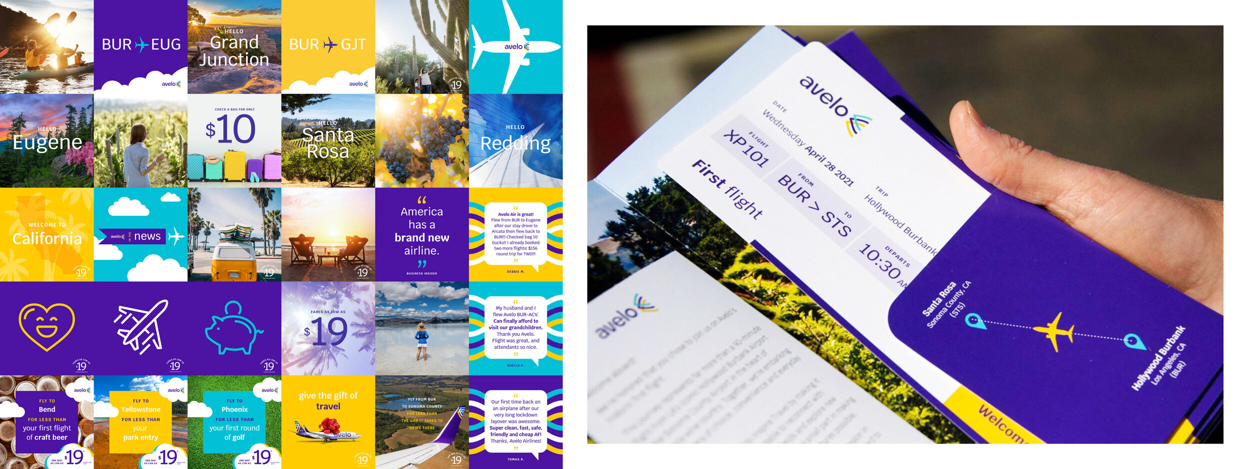
“Simple and smooth” is the inspiration behind everything Avelo does: they fly to and from smaller, more convenient airports than larger city hubs. They make beautiful destinations accessible to a broad spectrum of travelers for surprisingly low fares. They provide training and create jobs in the communities they serve. Their “neighborly” personality invites a sense of ease and calm in an environment that is famously stressful. And their “soul of service” is evident in how they do everything within and without– kindly, compassionately, always on the traveler’s side.
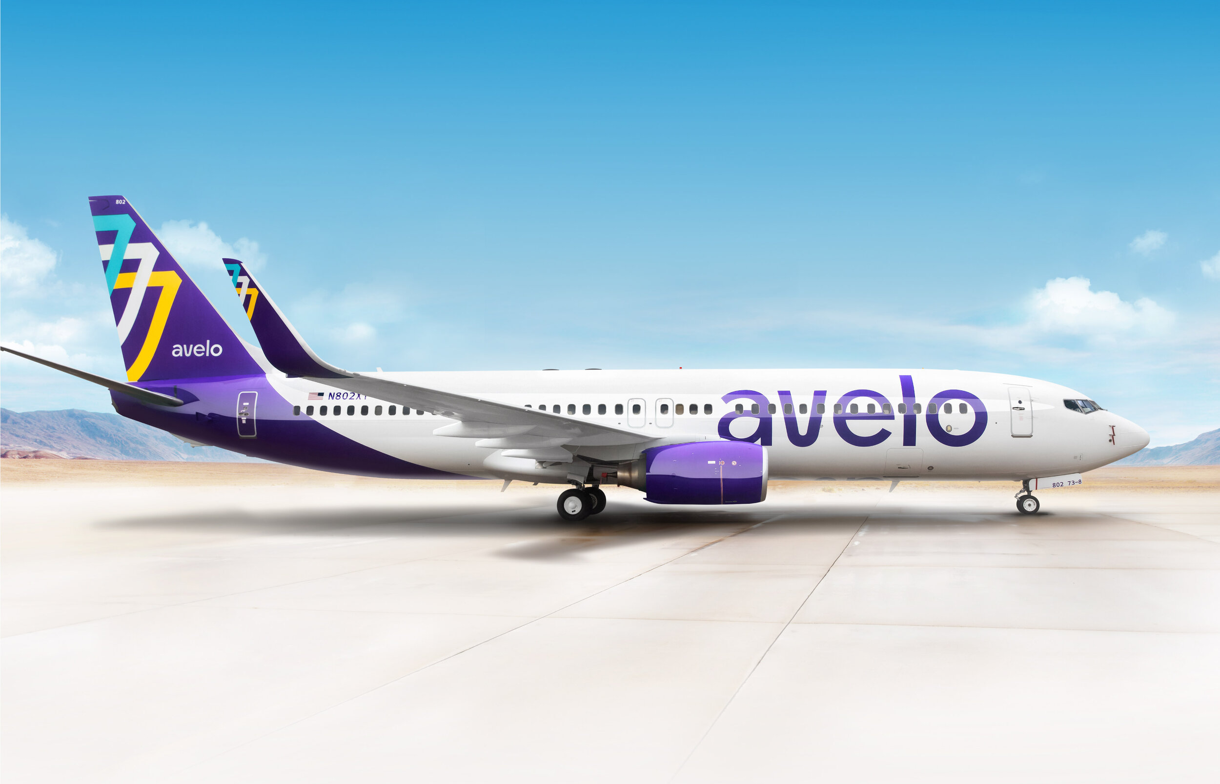
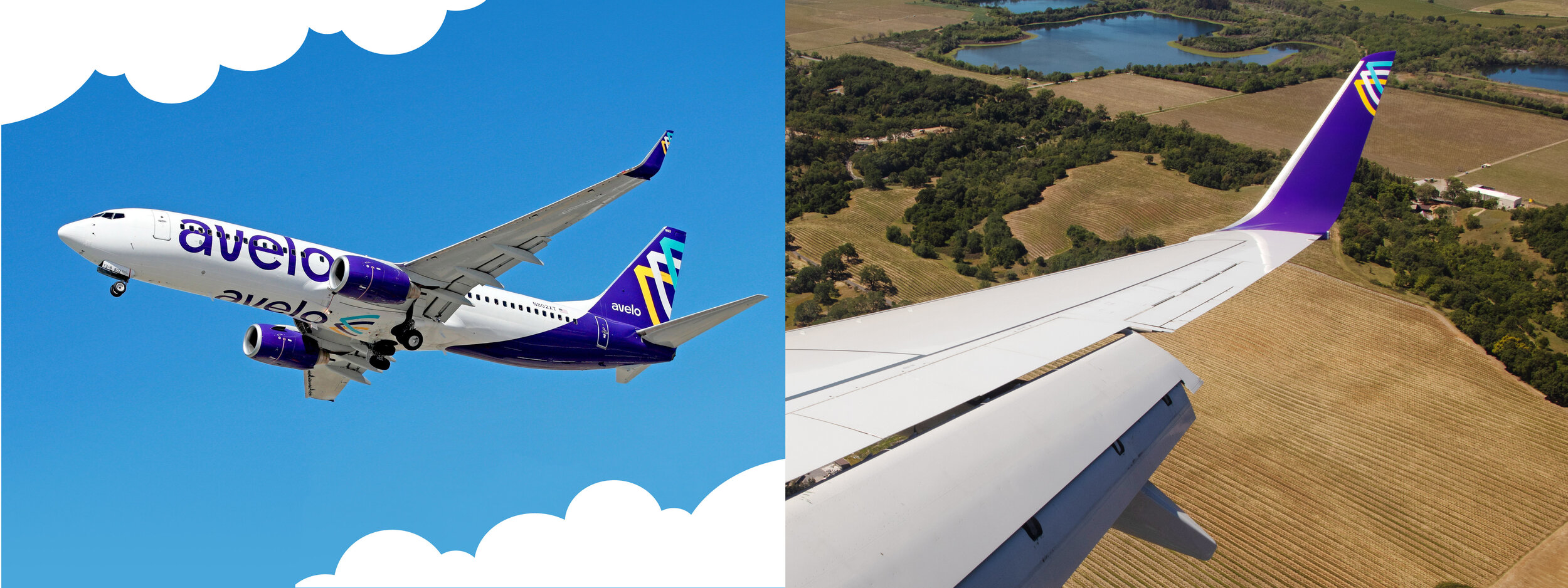
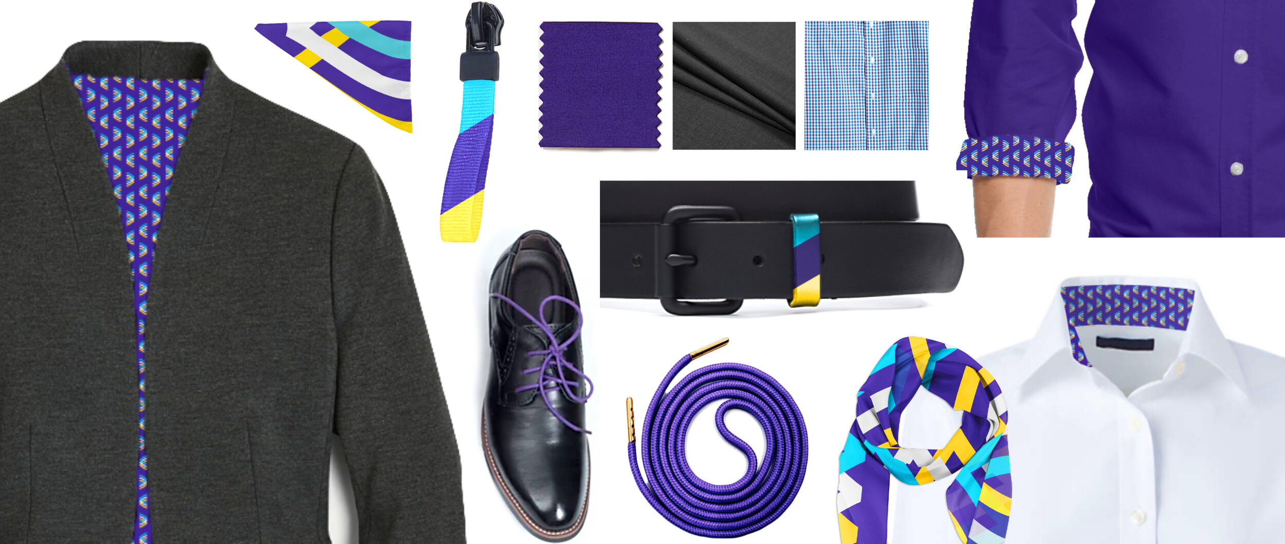
There were very specific practical constraints– guardrails to help keep us on time, on budget and on brand. Material, functional and regulatory implications impacted all our choices– everything from where and how to paint the plane, to uniform selection, to which colors and typefaces we could use. For example, there are sound strategic reasons behind splitting the livery between white and violet, right down to the precise contour and location of the swoop. The brand symbol needed to be bold, simple and recognizable under very specific conditions: detached from the name, cropped within an awkward shape, viewed from far away, moving at high speeds and recognizable when flipped. The wordmark needed to live comfortably on the side of the fuselage, with allowances for requisite mechanical features without disturbing the readability of the name. Compliant colors and Google fonts were mandates. The IT function required use of predesignated back-end solutions. Signage needed to be modular and transportable. While requests such as these might seem limiting, it helped us laser-focus our efforts where they would have the most impact for the brand overall.
We engineered an all lowercase wordmark with friendly, rounded typography that flows smoothly from one letterform to the next. The mark culminates in a swift, uplifted, wing-like symbol, each of its three rising streams representing the essential components of the business– Customers, Crewmembers and Community, all taking flight together.
Visual strategy revealed many interesting insights as we researched the competitive landscape. The most intriguing, however, was to uncover how some of the biggest, best-known carriers were quietly injecting shades of purple into their primarily red and blue brands– as if calling out for change, but too entrenched to own that shift. We discovered a unique opportunity for Avelo to occupy a specific place on the color and sophistication spectrums that none of their direct competitors could claim. Little did we know we’d forecasted a trend– the transformative power of purple, as evidenced by Veri Peri, Pantone’s 2022 color of the year.
All the above is encoded into the entire visual system, impacting every touchpoint across the brand. The resulting impression is equally congenial and credible– a refreshingly simple brand that feels– and acts– like a breath of fresh air in the ultra-low cost air travel category.
Ten months into service, Avelo continues to flourish– they’ve earned an additional $42 million in funding and now have hubs on both coasts. They’re continually adding more destinations and strategically growing their fleet. They attract the best pilots by offering among the highest pay in the industry. And with a near-fanatical customer base, they’re causing rivals old and new like Spirit, Frontier and Breeze to rethink their businesses.
We entered this relationship as mutually respected professionals– and left it as brand advocates and cheerleaders, rooting from the sidelines for the success of this little airline that could.